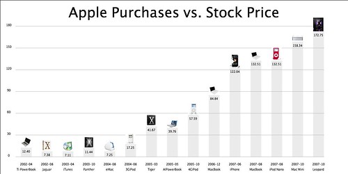
In learning Processing, it occurred to me that it could be used to produce visuals previously done via traditional tools like spreadsheets and presentation software. Using Processing means that layout decisions are programmed in -- for example the placement of pictures to annotate a barchart; instead of tediously placing each graphic, the placement is automatic. To test this, I used this graphic, produced in Keynote as a basis:
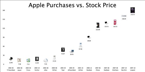
Here is the same data, but produced by code in Processing:

In comparison to the original Keynote graphics, I toned down the bar chart color significantly, and also plotted the products pictures as data, instead of axis labels.
The Data
Of course, visuals must be data driven, and Processing can take input from files; in this case, tracking stock price with other events: Apple Stock price to personal purchases,(incidentally this kind of visualization can based from other things as well, Google products. vs. stock price, Fat content of foods, IMDb ratings, or a drug companies product launches vs. stock price, etc.
The relevant stock data can be obtained from Yahoo Finance -- select the relevant time interval, and then download the data as a CSV file. Note that these visualizations work best if there is not too many data points.
The data file that my Processing code uses consists of these fields:
date, stock price, picture file, product name (with the exception of the first line, used to specify the title
Apple Purchases vs. Stock Price
2002-04,12.4,tipb.jpg,Ti PowerBook
2002-08,7.38,jaguar.png,Jaguar
2003-04,7.11,itunes.jpg,iTunes
...
2007-10,172.75,leopard.jpg,Leopard
The code
The code (166 lines) is broken down into these sections:- Read in the data, with sanity checks
- Define major object locations based on percentages relative to the graphic's width and height (for example, the title is defined to be located at 7% of the overall height)
- Define scaling factors
- Show Title
- Show the Y axis label, and the Grid
- Plot the data
The display of titles, bars, data values, labels, grid, images, names, and dates, can be independently toggled on or off, controlled via boolean variables.
Observations
The model visual has the traditional barchart, but invoking the option to remove the grid and bars allows the the product pictures and the stock values to serve as data points:
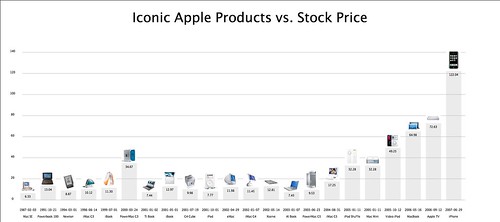
Here is a slightly different twist: Relating the introduction of "iconic" Apple products with the stock price:

Having complete control over every aspect of the graphic is freeing --- with Processing, you are not constrained by what a standalone software package can do --- if you can conceive it, you can easily program it in without waiting for Apple, Adobe, or Microsoft to add the feature or behavior. (Another useful side effect is that your graphics won't look like everyone else's).
Processing encourages this interactive "sketching" style. (in fact instead of "code" and "graphics", the Processing environment refers to these collectively as sketches.

I note that using percentages and not hard-wired "magic" numbers means that the graphic will scale when the height and width are adjusted. This means that you can pick the correct aspect ratio for a given data set and the various graphic elements remain in their proper places. Also, because each section of the graph is drawn and placed independently, re-arrangement and experimentation is easy: Need to move the product labels -- adjust one number -- hit the execution command, -- boom. Instant gratification.
I plan to continue this with other types of data -- See the flickr set for more.

2 comments:
Now write it to accept all the data as variables from a database.
/amy
Is the source code for this available? I have been thinking too of combining time series data with graphics.
Post a Comment