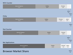
Pmaps are designed to show the data more clearly than pie charts by using color (the darker the color the greater the proportion), size (the width of the rectangle corresponds to the data's proportion) and position (the data is ordered from greater to least proportion).
The compact nature of pmaps allows you to compare related datasets by scanning vertically. For example the illustration shows how different sources report browser market share.
The pmap program is implemented in the Go programming language, and produces SVG via the svgo library
The program has various strategies to clearly show all the data: you may show any combination of labels, percentages, or raw data. The labels and data are automatically arranged for maximum visibility: if the data rectangle is too narrow, its labels is displayed as a call out. (the thresholds for label length and data size are adjustable). The style of call out is also configurable: staggered or alternating between above and below the data)
The command line:
pmap -stagger -p -g 100 -bg lightsteelblue -t "Browser Market Share" -showtitle bs.xml > bs.svgcreated the illustration above. It means: read data from bs.xml, create the pmap as a SVG file called bs.svg, stagger the overflow labels, show percentages, separate each map with 100 pixels, create a contrasting background, and display a title.
The input XML format is simple: a pmap consists of one or more data sets (pdata elements), which in turn contain items with a corresponding value:
<pmap>
<pdata legend="W3C Counter">
   <item value="43.2">Internet Explorer</item>
   <item value="31.2">Firefox</item>
   <item value="10.7">Chrome</item>
   <item value="4.2">Safari</item>
   <item value="1.4">Opera</item>
</pdata>
</pmap>
